
Jeli Learning Center
Discover how incident response is impacting your organization | Jeli Part of PagerDuty
Jeli End-of-LifeAs of December 22, 2026, the Jeli UI will reach end-of-life. Post-incident review capabilities will be integrated directly into PagerDuty's Post-Incident Reviews in the PagerDuty web app.
Sign up for Early Access and select Post-Incident Reviews in PagerDuty UI to try the integrated experience before its general release.
The Learning Center provides a high-level overview of the nature of incidents and incident response across your organization. By focusing on participation and on-call patterns, the Learning Center helps surface reviews' impact on people, systems and technology.
AvailabilityThe Jeli Learning Center is available with the Enterprise for Incident Management pricing plan.
Starting the week of February 3, 2025, customers on Professional and Business pricing plans may have access to the Jeli Learning Center. We are slowly releasing this feature in a phased manner. If you do not see the Jeli Learning Center in your account, it may not yet be available.
Please contact our Sales Team if you would like to upgrade to a plan featuring Jeli.
Filter Data
You can use the following filters to adjust the Learning Center visualizations:
- Time Frame: Select a time frame from the right-hand dropdown to expand or limit reviews included in the Learning Center visualizations. This will allow you to switch between viewing current and long-term trends in review data. You can select from Today, Since yesterday, Last 7 days, Last 30 days, Last year, or All time.
- Post-Incident Review Tags: Click Add tag(s) and select the desired Post-Incident Review tags to filter the review data. These tags are additive, so the more tags you add to your filters, the larger the data set will be.
Participation Patterns
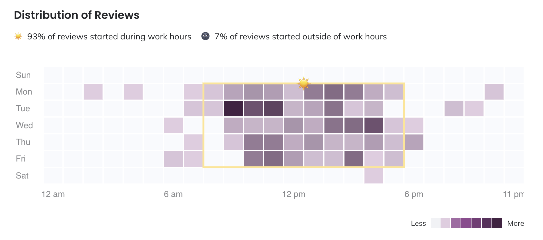
Distribution of Reviews
This visualization displays the impact of reviews on the people in your organization, and the dates and times that incidents occur most frequently. A darker square indicates more reviews occurred in that time frame. You can also see which reviews occurred during your working hours, which are marked by a yellow outline.
Distribution of reviews
Click on any square in the heat map to see a list of the reviews that occurred on that date and time.
Change Working Hours
Working hours are defined as 8 a.m. to 5 p.m. The review distribution chart is based off of the timezone dropdown in the top menu bar. You can change your timezone to view the distribution of reviews in other timezones.
Review Participants
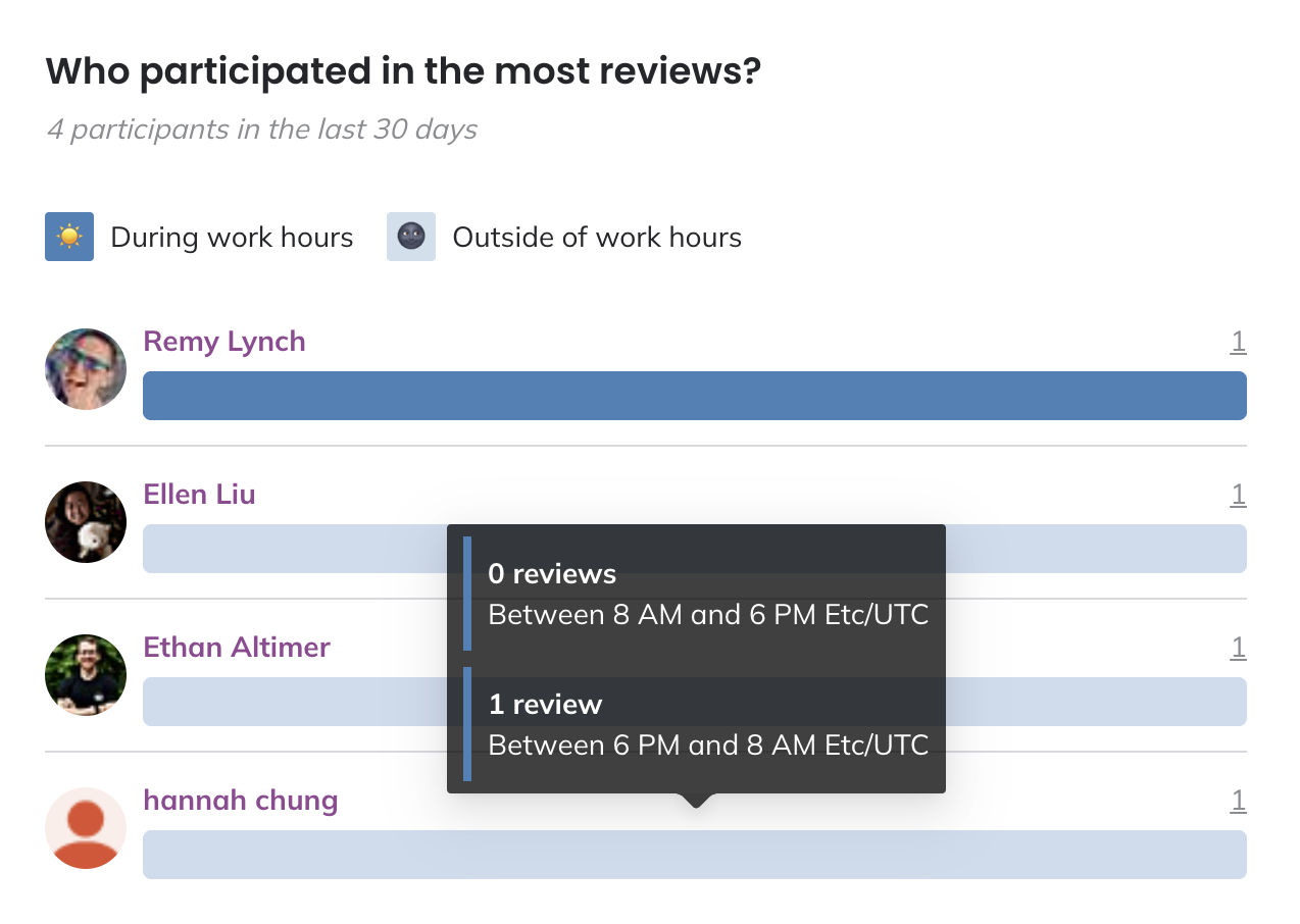
Who participated in the most reviews?
This visualization displays who is most frequently involved in reviews, and when they’re participating relative to their working hours. You can perform the following actions within this chart:
- Hover over an individual’s name to see more information about them. Click on their name to navigate to their profile.
- Hover over their participation bar to see a breakdown of reviews that occurred during and outside of working hours.
- Click on an individual’s total review count to see a list of the reviews they responded to within the selected time frame.
Review participants
Participant Tenure Distribution
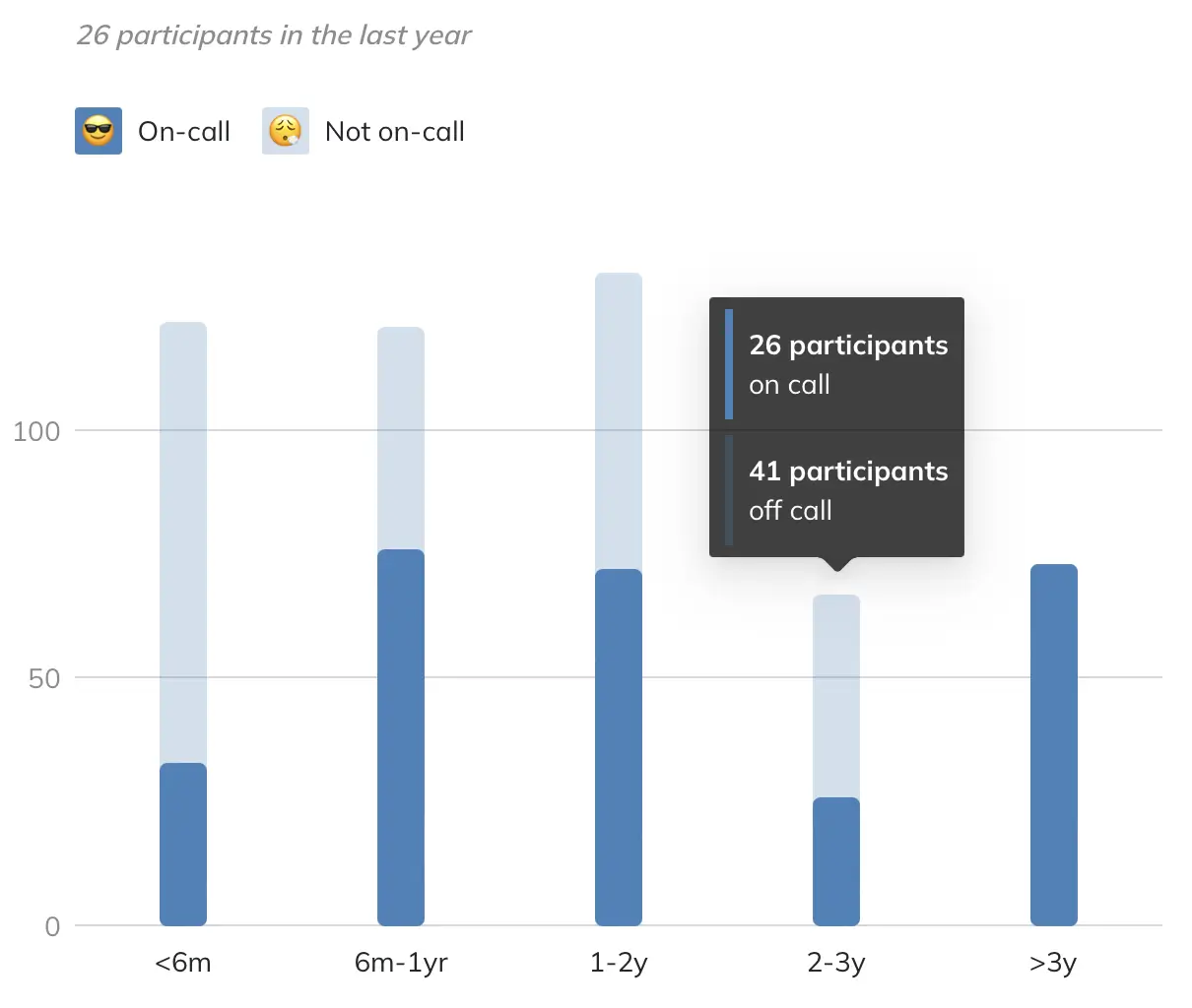
What was the distribution of tenure among participants?
Use this visualization to observe how participation levels fluctuate across various tenure levels within your organization. You can also determine how frequently participants engage when they are not on call during the specified time period.
Tenure distribution
NoteIf you have not imported HR Data yet, you will see a prompt to complete this step first.
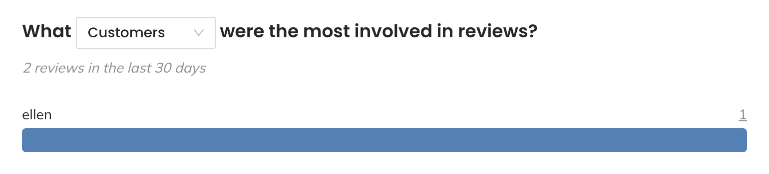
Post-Incident Review Tag Distribution
This visualization displays which Post-Incident Review tags by type are most frequently associated with Post-Incident Reviews (e.g., What services were the most involved in Post-Incident Reviews?). You can perform the following actions within this chart:
- Toggle between tag types using the dropdown in the chart title.
- Click on the total Post-Incident Review count to see a list of the Post-Incident Reviews associated with each item within the selected time frame.
Post-Incident Review tag distribution
On Call Patterns
Reviews with Participants not On Call
Use this visualization to see which reviews had the highest levels of participation from people who were not on call. You can perform the following actions within this chart:
- Click the review name to view the review report.
- Click the participant total to see a list of the participants who were not on call.
- Click the participant list at the bottom to see more information about participants who most commonly appeared in the reviews.
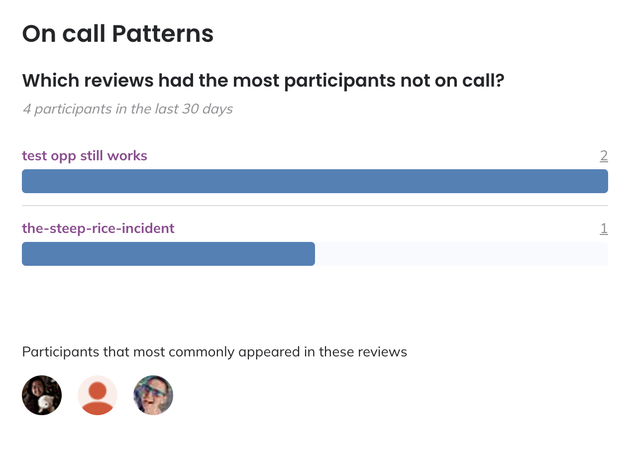
Reviews with participants not on call
Participant Activity While not On Call
Use this visualization to see which participants were most often involved in reviews they were not on call for. You can perform the following actions within this chart:
- Hover over an individual’s name to see more information about them. Click on their name to navigate to their profile.
- Click on the individual’s total review count to see a list of the reviews they responded to within the selected time frame.
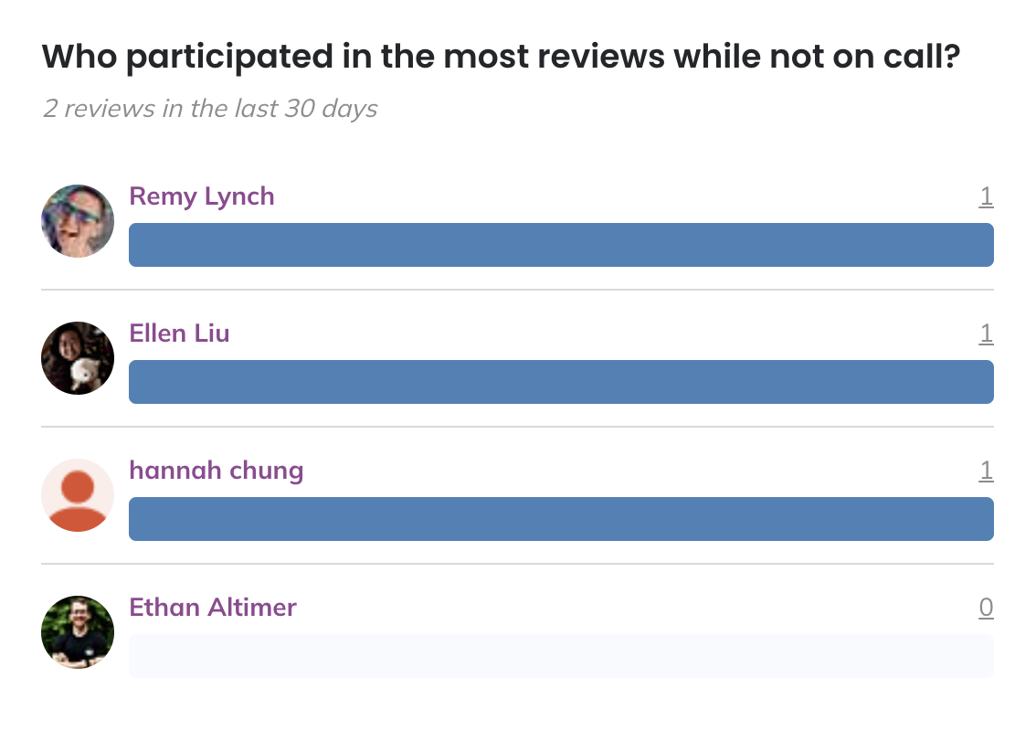
Participants not on call for the review
Updated 19 days ago